CETAPHIL (RESKIN)
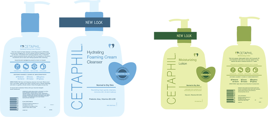
I redesigned the packaging and logo for Cetaphil with a fresh, modern aesthetic to better connect with a younger audience. By simplifying the logo and incorporating clean lines, soft colors, and a minimalist layout, the new design reflects a more contemporary, visually appealing look. This updated style maintains Cetaphil's trusted identity while making it feel more relevant and engaging for today’s skincare-savvy generation.
Beyond visual appeal, I created this redesign to give Cetaphil a stronger presence on crowded shelves, positioning it to compete directly with trend-driven skincare brands. The use of a cohesive color system makes each product easily identifiable, while still feeling unified across the full line. Thoughtful typography enhances readability at a glance, and the minimalist structure communicates both clarity and trustworthiness. Together, these elements elevate Cetaphil from a purely clinical look to a brand that feels approachable, stylish, and competitive—capable of capturing attention while reassuring customers of its dermatologist-recommended reputation.